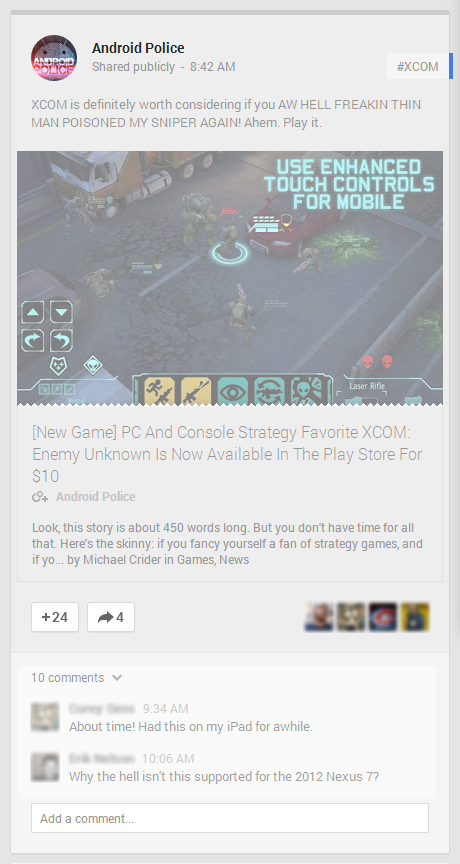
Of course, less than a month after I made my post Google completely overhauled the look of Google+.
My two main points were 'Mark as Read' and 'Starred Posts'. Neither were updated in the overhaul, so I figured I would re-visit them. Well, one of them.
Mark As Read (for the new layout)
This is a simple change. A few simple CSS changes as far as UI goes. The back-end would obviously be a bit more, but that can be saved for someone else to write.I made a few quick and dirty mock-ups, including New Posts, Read Posts & Updated Posts.
 |
| New (unread) Posts: would have a green bar at the top of the card. |
 |
| Read Posts: All posts (with no new comments) will be greyed out. |
 |
| Updated Posts: Any post that has a new comment since last view would have an orange bar atop the card and would highlight any new comments. |

